The wrong suit colour rarely looks disastrous in isolation. It simply feels slightly out of step – too heavy for the setting, too sharp for the hour, too cool against the complexion, or too eager beside the rest of the wedding styling. That is why learning how to pick a wedding suit colour palette matters. The best result is not just a handsome suit, but a coherent picture where cloth, light, venue and personal style all speak the same language.
For a groom, colour is never a decorative afterthought. It changes how the cloth drapes, how formal the suit appears, how photographs read, and how confidently you carry yourself from ceremony to last dance. A well-judged palette gives you presence without looking contrived. It should feel considered, not costume-like.
How to pick a wedding suit colour palette starts with the setting
Before fabric books are opened, look at the environment. A suit does not exist on a hanger. It lives in a church, a registry office, a country house, a city hotel, a marquee, or a destination venue flooded with hard sunlight. Each setting alters how colour behaves.
A formal evening wedding naturally supports deeper shades. Midnight navy, charcoal and rich black-adjacent tones read with authority under lower light and pair beautifully with crisp shirting. By contrast, a summer garden ceremony invites more air into the palette. Mid-blue, lighter grey, muted stone and tobacco can feel more appropriate because they reflect the softness and openness of the day.
Venue materials matter too. If the backdrop is warm stone, wood panelling and candlelight, earthy tones often sit more elegantly than icy greys. If the setting is architectural and modern, cleaner shades such as deep navy or graphite may feel sharper. This is one of the most overlooked aspects of how to pick a wedding suit colour palette – choosing a colour that belongs to the room as much as to the man wearing it.
Season should guide the weight of the colour
Men often think of season only in terms of temperature. In tailoring, season also affects visual weight. Some colours feel grounded and substantial. Others feel open and lighter, even when the suit itself is meticulously structured.
In autumn and winter, darker palettes tend to look more convincing. Forest green, deep navy, charcoal, dark brown and burgundy accents all carry natural richness. They harmonise with heavier cloths such as flannel, fresco, cavalry twill and textured worsteds. These combinations create depth, which is particularly flattering in low light and during evening receptions.
In spring and summer, the same dark tones can still work, but they need breathing room. A navy suit in a lighter cloth can look superb where a near-black tone may appear severe. Softer blue, light grey, taupe, sage-inflected neutrals and understated beige families become more persuasive in daylight. The point is not to chase a pale suit simply because it is warm outside. Rather, the colour should feel seasonally intelligent.
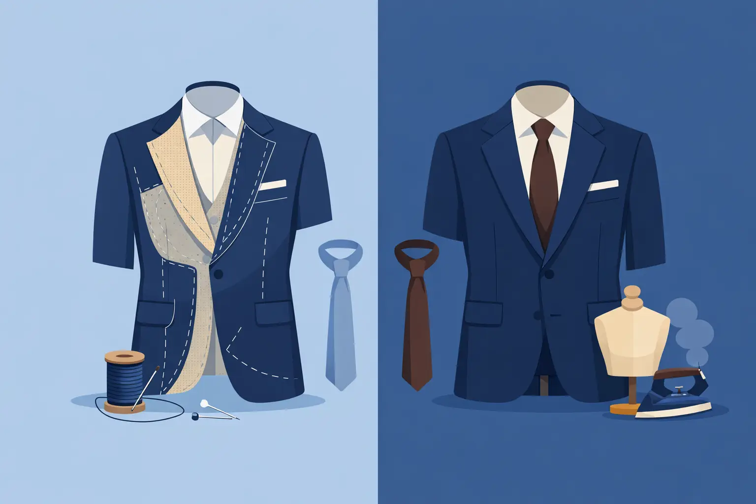
Match colour to cloth, not just a swatch
Colour alone never tells the whole story. Navy in a matte wool hopsack reads very differently from navy in a lustrous mohair blend. Brown in a dry, textured weave can feel contemporary and refined, while the same brown in a shinier finish can look dated.
This is where bespoke guidance proves its worth. A skilled tailoring house will help you assess not only the shade, but the finish, texture and drape that give the colour its character. If you want the palette to feel luxurious rather than flat, cloth selection is inseparable from colour selection.
Consider complexion, hair and contrast
The most successful wedding suit colour palette should flatter the man first, the mood board second. Skin tone, hair colour and natural contrast all influence whether a suit enlivens your appearance or drains it.
Men with darker hair and higher contrast often wear strong shades beautifully – deep navy, charcoal, bottle green and richer chocolate tones can look particularly assured. Men with fairer colouring or lower contrast may find that very dark cloth overwhelms them unless it is softened with the right shirt, tie and accessories. In those cases, mid-blue, lighter grey, soft brown or muted green can produce a more balanced result.
Undertone plays a part as well. Cooler complexions often sit well with blue-based colours, graphite and certain cool greys. Warmer complexions usually come alive in earthy neutrals, olive, tobacco and richer browns. There are exceptions, of course. The objective is not to follow a rigid chart but to notice whether the cloth adds clarity to the face.
If you try on a suit and your face appears tired while the fabric seems to dominate, the colour is probably doing too much. The finest tailoring still benefits from the right visual harmony.
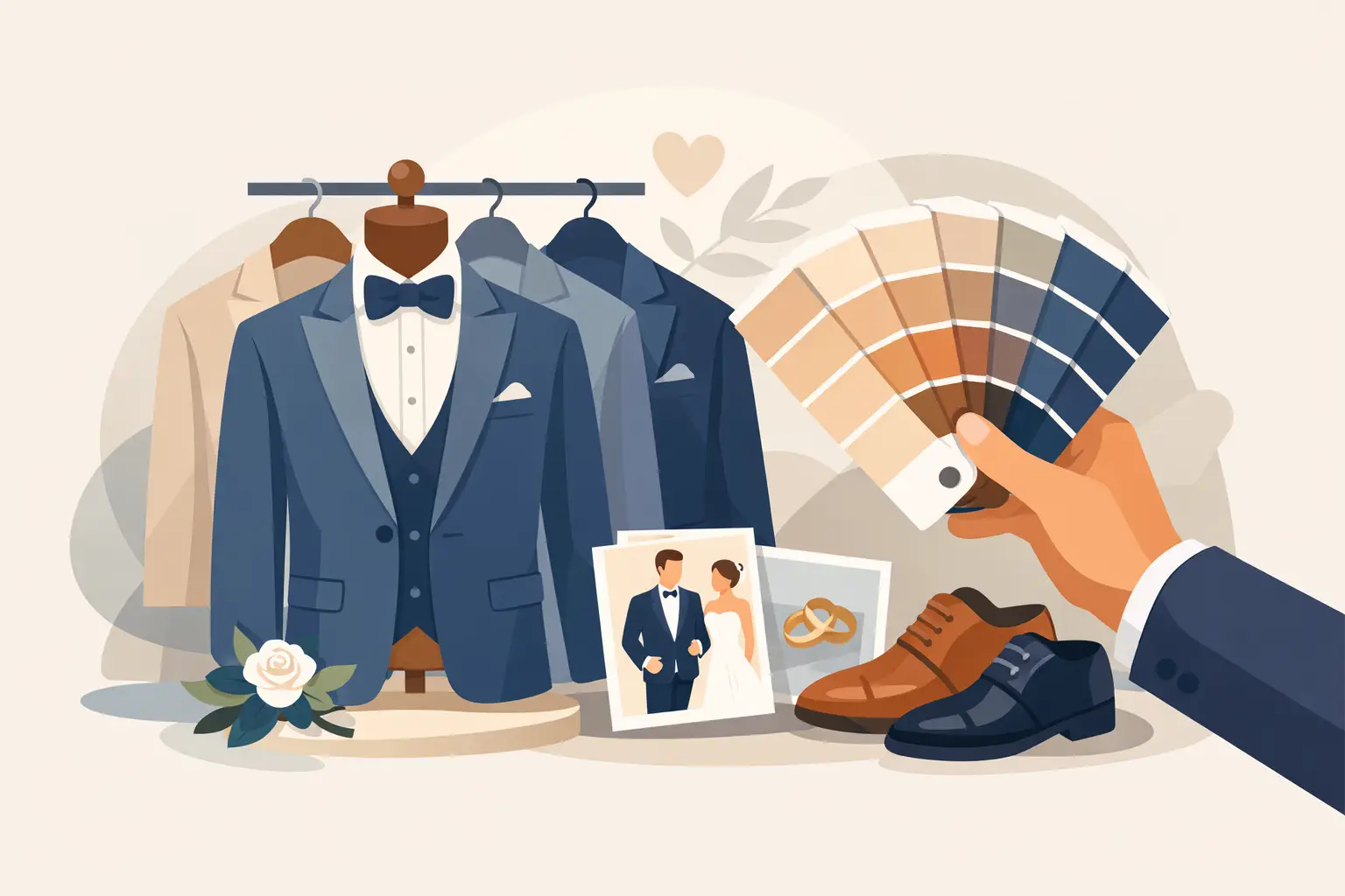
Think in a palette, not a single suit colour
When clients ask how to pick a wedding suit colour palette, they often mean the jacket and trousers alone. In reality, the palette includes the shirt, tie, pocket square, waistcoat if worn, shoes, boutonniere and even metal hardware. The suit colour should be the anchor, not the entire conversation.
Take navy as an example. It can be directed in several ways. With a white shirt, silver-grey tie and black shoes, it becomes formal and crisp. With an ivory shirt, bronze silk tie and dark brown shoes, it turns warmer and more romantic. With a textured waistcoat in a tonal blue-grey, it gains depth without becoming busy.
This is why restraint usually looks more expensive than excess. A wedding palette does not need five competing colours. It needs one dominant tone, one or two supporting tones, and enough contrast to create definition. Too many accents can make a bespoke suit look oddly unsettled.
How to use accent colours well
Accent colours should support the occasion rather than advertise themselves. Burgundy, rust, sage, dusty rose, antique gold and muted teal can all be elegant when introduced through a tie, pocket square or floral detail. The key is control.
If the suit is already distinctive, keep the accessories quieter. If the suit is classic and understated, the accessories can add personality. A groom should look memorable because everything is in proportion, not because each element is demanding separate attention.
Formality still matters
Modern weddings are more personal than ever, but dress codes have not disappeared. A colour palette that ignores the level of formality can feel jarring, even if each individual piece is attractive.
Black and very dark midnight tones remain the most formal options, particularly for evening weddings or black tie settings. Navy is extremely versatile and, in many wedding contexts, the smartest choice because it retains elegance without feeling overly rigid. Charcoal offers seriousness and polish, though it can occasionally feel more business-like unless elevated by texture and accessories.
Brown, green and lighter neutral palettes have tremendous charm, but they depend on context. In a countryside wedding, they can look beautifully assured. In a highly formal city setting, they may need sharper styling to hold the same authority. There is no universal hierarchy beyond this basic truth: the more ceremonial the event, the more disciplined the palette should be.
Coordinate, do not clone
If there are groomsmen, the goal is alignment rather than uniformity for its own sake. The groom should sit naturally within the wedding party while retaining distinction. That might mean the same core colour family with differences in tone, cloth texture or accessory treatment.
For example, the groomsmen may wear mid-navy while the groom wears a deeper navy three-piece in a finer cloth. Or they may all wear grey, with the groom distinguished through a double-breasted waistcoat, richer tie fabric or more refined finishing. This approach photographs well because it feels intentional without becoming stiff.
A useful test is to view the whole party from a distance. If everyone blends into one flat block of colour, there is not enough hierarchy. If each man looks unrelated to the next, there is too much variation.
When to choose timeless over fashionable
Wedding photographs last longer than trend cycles. That does not mean your suit must be conservative, but it should not be so trend-led that it dates quickly. Very pale neutrals, unusual fashion colours and aggressive contrast can look striking in the moment and less convincing over time.
The safest route is to build the suit in a timeless base colour and express personality through cut, cloth, and smaller details. A beautifully fitted navy, charcoal or refined earthy tone will always hold its stature. Peak lapels, a well-shaped waist, hand-finished details, a carefully chosen lining and elegant accessories can deliver individuality without sacrificing longevity.
At Manndiip, this is often where the consultation becomes most valuable – refining a client’s instincts into a palette that feels distinctive, flattering and worthy of the occasion.
If you are choosing your wedding suit now, resist the urge to ask only what is popular. Ask what will look precise on your frame, coherent in your venue, and convincing in ten years’ time. The right palette does more than match the flowers. It gives your presence a sense of certainty, which is exactly what fine tailoring is meant to do.